


Decoding the Spectrum: The Unspoken Language of Color in Presentations
Just as a couturier selects fabrics and hues to evoke a specific mood on the runway, understanding the psychology of color in PowerPoint design allows you to craft a powerful emotional experience for your audience. Color is not simply an aesthetic choice; it’s a direct conduit to human emotion, memory, and perception, influencing how your message is received long before a single word is uttered. Think of it as your presentation’s first impression – a critical moment, much like the unveiling of a new, highly anticipated luxury product. A well-chosen palette can convey authority, foster trust, ignite excitement, or soothe anxieties, making your audience more receptive and engaged. In a world saturated with visual information, differentiating your message through sophisticated color psychology is paramount. It’s the difference between a forgettable slide deck and a presentation that resonates with the polished impact of a top-tier marketing campaign, similar to the strategic branding employed when launching a successful skincare line. Every shade, every gradient, every contrast contributes to an overarching narrative, building a foundation of understanding and emotional connection that is as critical to communication as quality maternity care is for the health and well-being of mothers and infants.
For the discerning woman who understands that her influence extends beyond her personal style into every facet of her professional and creative endeavors, mastering this visual language is an indispensable asset. It empowers you to not just present information, but to tell a compelling story, to build a brand identity, and to guide your audience through a journey designed for maximum impact. From the subtle nuances of background colors to the bold statements of accent hues, each choice sends a signal. Are you aiming for innovative and cutting-edge, or reassuring and reliable? Do you want to energize your audience or inspire thoughtful reflection? The answers lie within the spectrum. By consciously applying color psychology, your PowerPoint presentations transcend mere data delivery, becoming an extension of your impeccable taste and strategic acumen, commanding attention and leaving a lasting impression that is both memorable and deeply persuasive. This is about elevating your communication to an art form, ensuring your ideas shine with the same brilliance as your personal brand.
The Power Palette: Individual Colors and Their Psychological Impact
Every color in the spectrum carries its own unique psychological resonance, a silent echo that speaks volumes to your audience. For the woman who curates her life with intention, understanding these individual power players is essential for mastering the psychology of color in PowerPoint design. Let’s explore the core emotional messages each hue conveys, transforming your slides into a symphony of strategic influence.
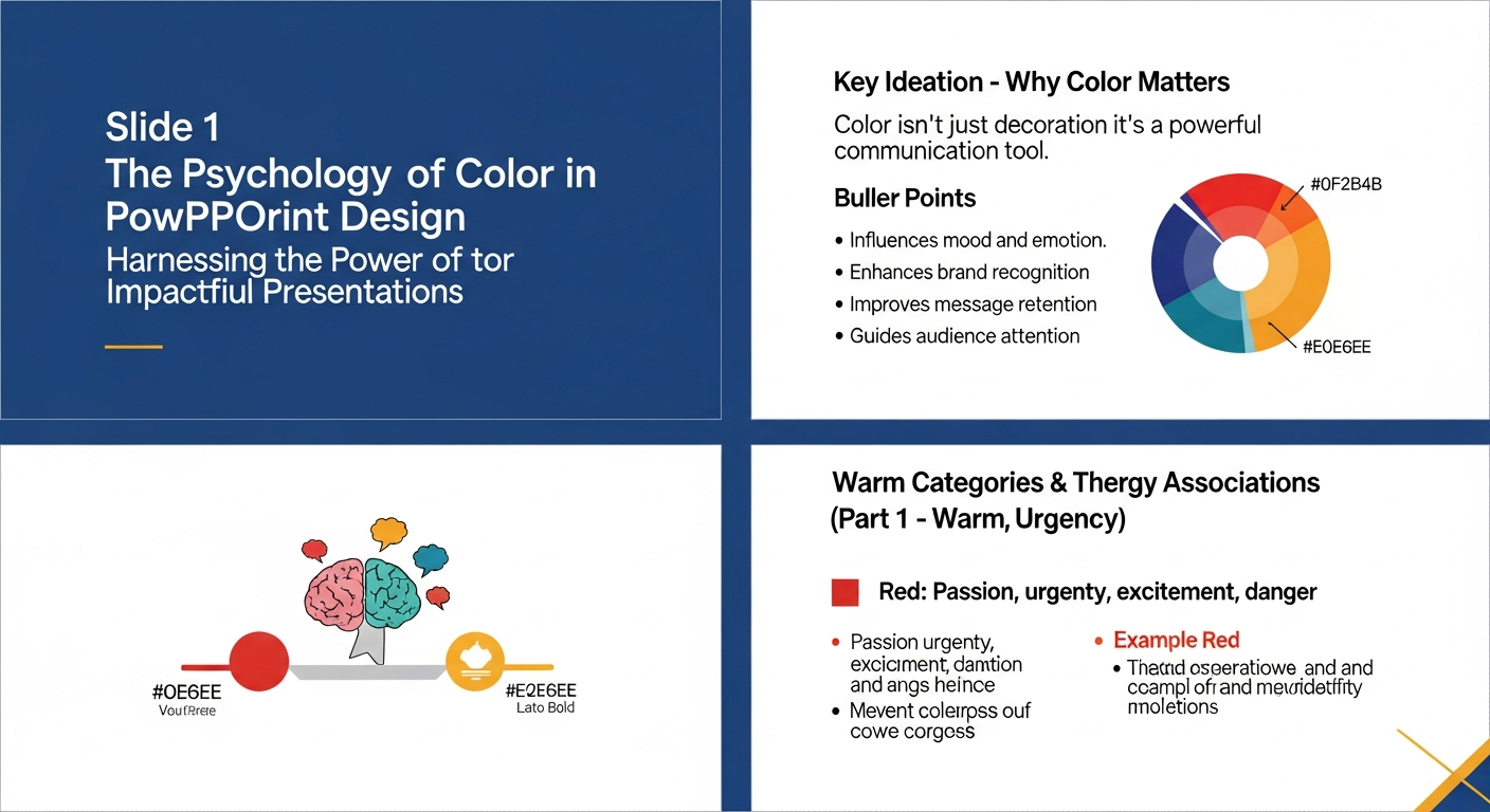
- Red: The Bold Statement. Red is the color of passion, energy, urgency, and power. It demands attention, much like a show-stopping red carpet gown. In your PowerPoint, use red sparingly for calls to action, critical data points, or to convey a sense of excitement and importance. It can signify strength and determination, perfect for presentations on ambitious goals or innovative breakthroughs. However, overuse can lead to feelings of aggression or alarm, so wield its power with precision and grace.
- Blue: The Trustworthy Ally. Blue evokes feelings of trust, calm, professionalism, and stability. It’s the go-to for corporate presentations, financial reports, or any context where credibility is paramount. Think of the serene blue packaging often chosen by luxury skincare lines to imply purity and efficacy. Light blues can be soothing and intellectual, while darker navies convey authority and depth. Blue backgrounds provide a sense of grounded professionalism, creating a reassuring atmosphere where your audience feels secure in your expertise.
- Green: The Growth Catalyst. Associated with nature, growth, health, wealth, and harmony, green is an incredibly versatile color. It’s ideal for presentations on sustainability, environmental initiatives, financial prosperity, or health-related topics. A soft green can create a calming and positive environment, particularly when discussing sensitive subjects like community well-being or the critical importance of quality maternity care. For a successful skincare line focusing on natural ingredients, green is an obvious choice for branding and presentation materials, instantly communicating purity and organic origins. It speaks of freshness and renewal, fostering a sense of positive progression.
- Yellow: The Radiant Optimist. Yellow radiates optimism, creativity, warmth, and joy. It can be incredibly uplifting and attention-grabbing, perfect for inspiring innovation or celebrating success. Use bright yellows for highlighting key ideas that you want to stand out immediately. However, too much intense yellow can be overwhelming or even signal caution, so balance it with more subdued tones. A pop of golden yellow can signify luxury and aspiration, adding a sophisticated sparkle to your slides.
- Purple: The Sophisticated Visionary. Traditionally associated with royalty, luxury, wisdom, and sophistication, purple is a color of creativity and imagination. It’s perfect for presentations that aim to inspire, discuss innovative concepts, or position your brand as exclusive and high-end. Think of the opulent packaging of premium beauty products. Deeper purples convey gravitas and wisdom, while lighter lavenders can suggest creativity and calmness, making your presentation feel both intelligent and uniquely stylish.
- Orange: The Enthusiastic Innovator. Orange combines the energy of red with the happiness of yellow, resulting in a color that signifies enthusiasm, creativity, warmth, and approachability. It’s great for presentations aimed at younger demographics, creative pitches, or when you want to inject a sense of dynamic optimism. Like yellow, use it as an accent to grab attention without overwhelming the audience. It’s a color that exudes confidence and a forward-thinking spirit.
- Black: The Epitome of Elegance. Black is the ultimate symbol of sophistication, power, elegance, and mystery. In PowerPoint design, it can create a dramatic, luxurious backdrop, making vibrant colors pop. It’s often used in high-fashion presentations or for brands that want to convey exclusivity and gravitas. While powerful, an all-black presentation can sometimes feel heavy or formal, so pair it with contrasting text and impactful imagery to maintain balance and visual interest.
- White: The Pure Canvas. White represents purity, simplicity, clarity, and modernity. It provides a clean, minimalist canvas that allows your content to breathe and stand out. It’s excellent for creating a sense of spaciousness and clarity, making complex information more digestible. Many clean beauty and skincare brands utilize white extensively to communicate transparency and purity. White backgrounds are classic for readability and a sophisticated, understated aesthetic.
- Gray: The Balanced Foundation. Gray is the color of balance, neutrality, and sophistication. It can serve as an excellent primary or secondary color, providing a stable, elegant foundation upon which other colors can shine. Lighter grays feel modern and understated, while darker charcoals can convey seriousness and professionalism. It’s a versatile hue that supports without distracting, allowing your key messages and vibrant accents to take center stage, much like a perfectly tailored neutral ensemble.
By understanding these individual color personalities, you can meticulously curate a palette that not only looks stunning but also strategically enhances your message, ensuring your presentation is as impactful and memorable as your personal brand.
Crafting Your Visual Narrative: Strategic Color Application in PowerPoint
Audience Analysis: Tailoring Your Palette
Before you even begin selecting colors, consider your audience. Who are you speaking to? What are their cultural backgrounds, their professional expectations, and their emotional predispositions? A presentation for a creative agency might embrace bold, unconventional color schemes, while a board meeting for a financial institution would likely require a more subdued, trustworthy palette of blues and grays. Understanding your audience is the first step in ensuring your color choices resonate, rather than alienate. This foundational step is akin to understanding your target demographic when developing marketing tips for launching a successful skincare line – you wouldn’t use the same messaging or aesthetic for a Gen Z audience as you would for luxury anti-aging consumers.
Brand Consistency: Reinforcing Your Identity
Your presentation is an extension of your personal or corporate brand. The colors you choose should seamlessly integrate with your existing brand identity, reinforcing recognition and professionalism. If your brand palette features vibrant magentas and golds, don’t suddenly switch to earth tones unless there’s a compelling strategic reason. Consistency builds trust and strengthens your visual presence, making your brand instantly recognizable and memorable. Just as a signature scent or a specific designer’s aesthetic becomes synonymous with you, your presentation colors should echo your unique brand voice, making every slide unequivocally yours.
Contrast and Readability: The Practical Elegance
The most beautiful color scheme is useless if your audience can’t read your content. High contrast between text and background colors is non-negotiable for readability. Dark text on a light background (or vice versa) is always the safest bet. Avoid busy backgrounds that compete with your text or images. For a truly elegant and sophisticated look, ensure your color choices enhance, rather than hinder, clarity. This attention to detail is paramount, ensuring that your message is always delivered with crystal-clear precision, a hallmark of true professionalism.
Emotional Arc: Guiding the Journey
Think of your presentation as a story with a beginning, middle, and end. Can your color choices help guide your audience through this emotional arc? You might start with a calming blue to establish trust, transition to an energetic orange for a call to action, and conclude with a sophisticated purple to leave a lasting impression of wisdom and foresight. Using color to subtly shift the mood and focus can dramatically enhance engagement and comprehension, creating a dynamic and memorable experience for your viewers. It’s about orchestrating an emotional journey, much like a skilled director uses lighting and set design to influence audience feelings.
The 60-30-10 Rule: A Design Classic
For a balanced and visually appealing color scheme, consider the 60-30-10 rule, a principle widely used in interior design and fashion. Apply 60% of your chosen palette to your dominant color (often a neutral or your primary brand color), 30% to your secondary color, and 10% to an accent color. This creates harmony and allows certain elements to pop without overwhelming the eye. For example, a dominant elegant gray (60%), a sophisticated deep blue (30%), and a striking gold (10%) for key highlights and accents. This rule ensures your presentation maintains a polished, cohesive, and effortlessly chic aesthetic, a true testament to discerning taste.
By meticulously applying these strategic principles, your PowerPoint presentations will transcend mere information delivery, becoming powerful vehicles of influence, persuasion, and impeccable style, worthy of your aspirational vision.
Beyond Aesthetics: Color Psychology for Persuasion and Impact

For the discerning woman, understanding the psychology of color in PowerPoint design extends far beyond mere aesthetics; it’s a potent tool for persuasion, influence, and driving tangible outcomes. Your presentation isn’t just a display of information; it’s an opportunity to sway opinions, inspire action, and solidify your position as a thought leader. The strategic deployment of color can dramatically amplify this impact, turning your slides into silent, yet incredibly effective, advocates.
Influencing Decision-Making
Colors have a profound, often subconscious, effect on decision-making. Research consistently shows that certain hues can increase feelings of urgency, trust, or desire. For instance, if your presentation aims to secure investment, using blues and greens can subconsciously build trust and convey stability and growth potential. If you’re advocating for a new, innovative project, pops of yellow or orange can ignite enthusiasm and creativity, encouraging your audience to embrace bold ideas. This subtle manipulation of emotion through color is a sophisticated persuasive technique, similar to the careful psychological triggers employed in marketing tips for launching a successful skincare line, where packaging color, website design, and ad visuals are meticulously chosen to evoke desire, trust, and a sense of luxury.
Highlighting Key Data and Calls to Action
In a world of information overload, guiding your audience’s eye is crucial. Color is your most effective tool for doing so. Use a vibrant, contrasting accent color (like a bold red or an energetic orange) to highlight critical statistics, key takeaways, or, most importantly, your calls to action. When you want your audience to “sign up,” “invest,” or “learn more,” ensure that button or text stands out with a color that demands attention and implies urgency or importance. This creates a visual hierarchy that ensures your most vital messages are never missed, cutting through the noise with precision and clarity.
Avoiding Common Color Pitfalls
While powerful, color psychology can be misused. Overuse of too many bright, clashing colors can create visual clutter and overwhelm your audience, making your presentation appear unprofessional and distracting. Similarly, using colors that evoke negative emotions (e.g., certain drab browns or sickly greens, unless intentionally used for contrast) can undermine your message. Always ensure sufficient contrast for readability, and avoid color combinations that might be difficult for individuals with color blindness to distinguish. A sophisticated palette is balanced, harmonious, and serves your message, rather than distracting from it.
The Subconscious Messages Conveyed
Every color choice sends a subconscious message. A presentation advocating for improved health outcomes, such as the critical importance of quality maternity care for mothers and infants, would benefit from a palette that evokes calm, trust, and hope – perhaps gentle blues, greens, and whites. These colors subconsciously reassure the audience, making them more receptive to sensitive information and more open to supporting life-affirming initiatives. Conversely, a presentation on a cutting-edge tech innovation might leverage sleek blacks, metallic silvers, and electric blues to convey modernity, sophistication, and forward-thinking vision.
Ultimately, by moving beyond purely aesthetic considerations, you transform your PowerPoint presentations into strategic instruments of influence. Mastering the psychology of color empowers you to not only captivate your audience but also to subtly guide their emotions, shape their perceptions, and ultimately, drive them towards the desired action. It’s about wielding visual power with the same elegance and efficacy that defines your personal brand, ensuring every presentation is a masterclass in persuasive communication.
The Celebrity Exchange Guide to Mastering Your Presentation Palette in 2026
As we stride confidently into 2026, the landscape of visual communication continues to evolve, mirroring the shifts in fashion, technology, and global consciousness. For the Celebrity Exchange woman, staying ahead means not just understanding timeless principles, but also embracing the contemporary trends that define the cutting edge of style and influence. Mastering the psychology of color in PowerPoint design now means integrating these forward-looking sensibilities to ensure your presentations are not just effective, but truly iconic.
Emerging Color Psychology Trends for 2026
The year 2026 will see a continued emphasis on colors that evoke wellness, authenticity, and digital fluidity. Expect to see palettes that blend natural, earthy tones with vibrant, optimistic accents. Think soothing sage greens, tranquil ocean blues, and warm terracotta, punctuated by energetic yellows, digital lavenders, and sophisticated metallics. There’s a strong lean towards colors that reflect sustainability, mental well-being, and clarity in a complex world. These palettes encourage a sense of grounded aspiration, perfect for presentations on innovative solutions, holistic well-being, or future-forward business strategies. Consider how a skincare line in 2026 might use these colors to emphasize natural ingredients and mindful consumption, creating a cohesive brand story from product to presentation.
Tools and Resources for the Modern Visionary
You don’t need to be a graphic designer to create stunning color palettes. The digital age offers an abundance of sophisticated yet user-friendly tools. Websites like Adobe Color, Coolors.co, and Paletton allow you to generate harmonious color schemes based on a single hue, explore complementary or analogous palettes, and even extract colors from inspiring images. Utilize these resources to create mood boards for your presentations, much like you would for a fashion collection or an interior design project. These tools democratize design, empowering you to craft professional-grade visuals with ease, ensuring your presentations are always on point and effortlessly chic.
Personal Branding Through Color: Your Signature Aesthetic
Your presentation palette is a powerful extension of your personal brand. Just as your wardrobe, accessories, and digital presence communicate who you are, so do the colors you choose for your slides. Do you exude bold confidence with vibrant reds and blacks, or serene authority with deep blues and creams? Are you a modern minimalist with whites and grays, or a creative visionary embracing jewel tones? Consistency in your chosen palette across all your professional communications – from your website to your social media to your PowerPoint presentations – builds a strong, recognizable, and sophisticated personal brand. It’s about creating a cohesive visual language that speaks volumes about your taste, your values, and your unique style, cementing your reputation as a woman of discerning influence.
Advocating with Empathy: Color for Critical Communications
Beyond the glamour and strategic business applications, the psychology of color plays a profound role in sensitive and critical communications. Consider presentations focused on vital health initiatives, such as advocating for the foundation of health and why quality maternity care is critical for mothers and infants. In such contexts, color choices must foster trust, calm, and hope. A palette incorporating soft blues, greens, and whites can create an environment of reassurance and empathy, making the audience more receptive to serious information and more inclined to support calls for action. Avoiding harsh or overly stimulating colors ensures that the focus remains on the urgent message and the well-being of the beneficiaries, rather than distracting from it. Here, color is not just about looking good; it’s about doing good, communicating with compassion, and building a visual foundation of care and reliability, much like the foundational importance of quality care itself.
By embracing these insights and tools, you can confidently navigate the evolving landscape of visual communication in 2026, ensuring that every PowerPoint presentation you deliver is a masterclass in style, substance, and strategic impact, leaving an indelible mark worthy of your esteemed presence.
Frequently Asked Questions
Recommended Resources
Check out Best Face Serums For Glowing Skin 2026 on The Contextual Life for a deeper dive.
Learn more about this topic in Cozy Fall Recipes For Entertaining at Rock Salt Plum.